CSSflex弹性盒
基本概念
弹性盒
flex(弹性盒、伸缩盒)
- 是
css中的又一种布局手段,它主要用来代替浮动来完成页面的布局
flex可以使元素具有弹性,让元素可以跟随页面的大小的改变而改变
弹性容器
要使用弹性盒,必须先将一个元素设置为弹性容器
我们通过display 来设置弹性容器
display:flex 设置为块级弹性容器display:inline-flex 设置为行内的弹性容器
练习(弹性导航条)
1
2
3
4
5
6
7
8
9
10
11
12
13
14
15
16
17
18
19
20
21
22
23
24
25
26
27
| <style>
.nav{
width: 1210px;
height: 48px;
margin: 50px auto;
line-height: 48px;
background-color: #e6e7e2;
display: flex;
}
.box{
flex-grow: 1;
}
.nav a{
display: block;
color: #808080;
text-decoration: none;
font-size: 16px;
text-align: center;
}
.nav a:hover{
background-color: #636363;
color: #fff;
}
</style>
|

弹性容器的属性
主轴与侧轴
- 主轴:弹性元素的排列方向称为主轴
- 侧轴:与主轴垂直方向的称为侧轴
主轴属性
排列方式
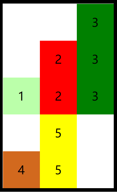
flex-direction 指定容器中弹性元素的排列方式
row默认值,弹性元素在容器中水平排列(自左向右)row-reverse 弹性元素在容器中反向水平排列(自右向左)column 弹性元素纵向排列(自上向下)column-reverse 弹性元素反向纵向排列(自下向上)
1
2
|
flex-direction: column;
|

自动换行
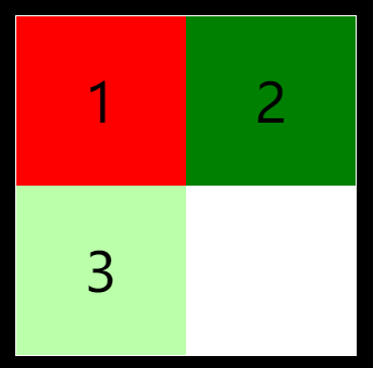
flex-wrap 设置弹性元素是否在弹性容器中自动换行
nowrap 默认值,元素不会自动换行wrap 元素沿着辅轴方向自动换行
1
2
3
4
|
flex-direction: row;
flex-wrap: wrap;
|
简写属性
flex-flow 是wrap和direction的简写属性
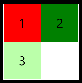
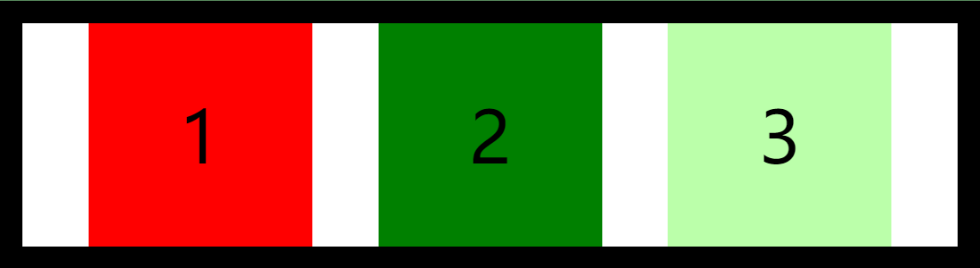
空白空间
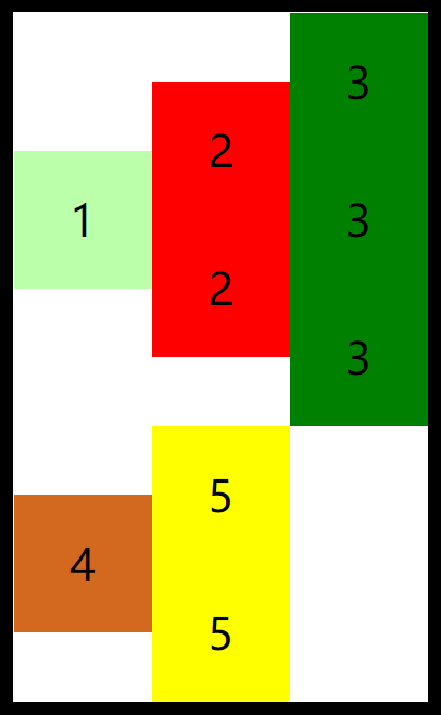
justify-content 如何分配主轴上的空白空间(主轴上的元素如何排列)
flex-start 元素沿着主轴起边排列

flex-end 元素沿着主轴终边排列

center 元素居中排列
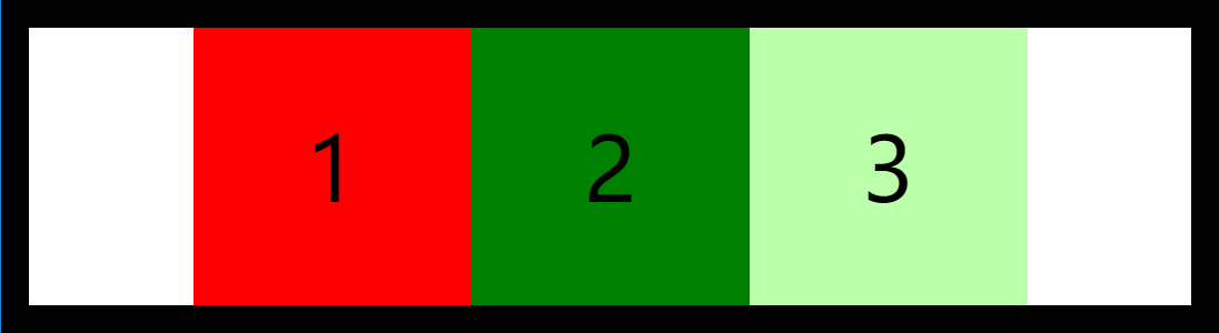
space-around 空白分布到元素两侧
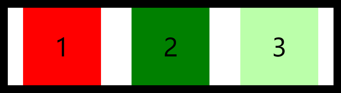
space-between 空白均匀分布到元素间
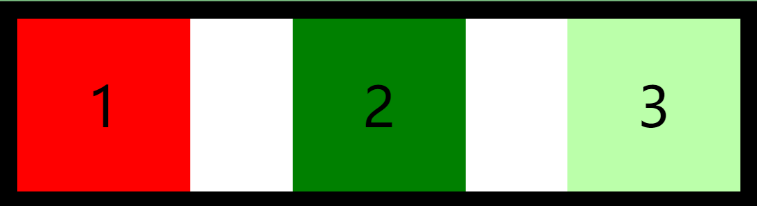
space-evenly 空白分布到元素的单侧
辅轴属性
辅轴对齐
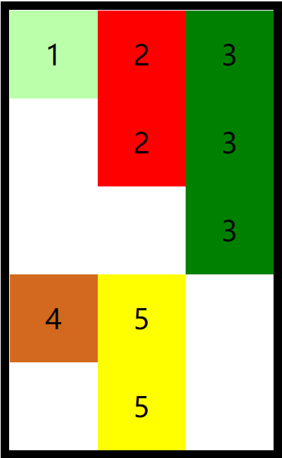
align-items元素在辅轴上如何对齐
空白空间
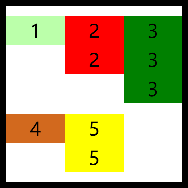
align-content 如何分配辅轴上的空白空间(辅轴上的元素如何排列)
flex-start 元素沿着辅轴起边排列
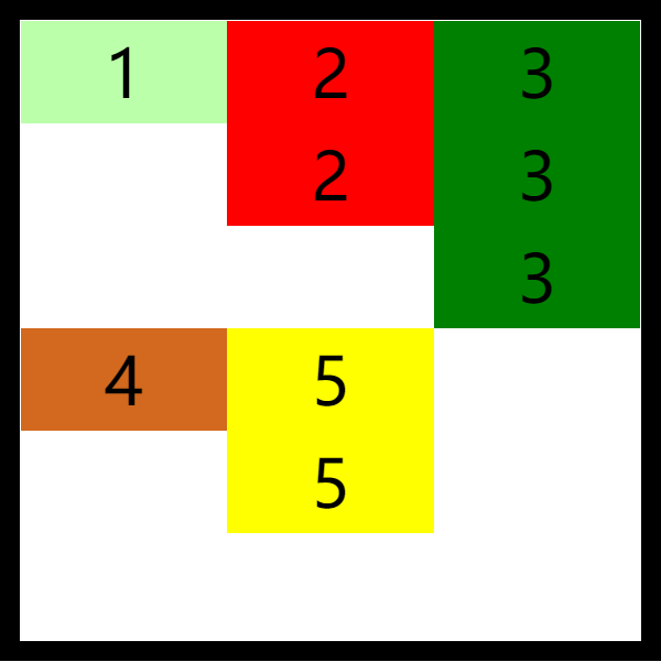
flex-end 元素沿着辅轴终边排列
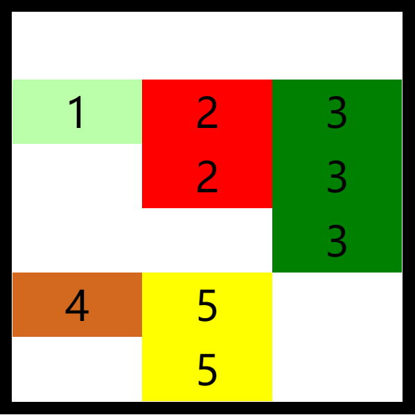
center 元素居中排列
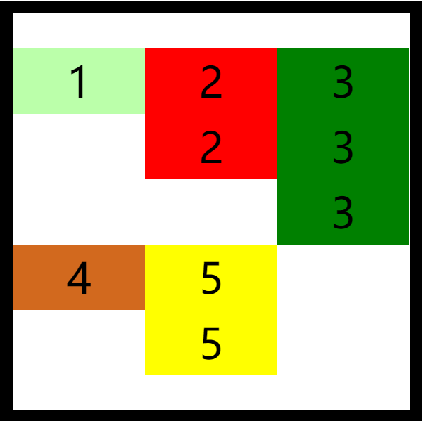
space-around 空白分布到元素两侧
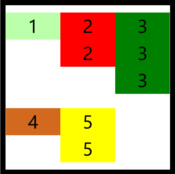
space-between 空白均匀分布到元素间
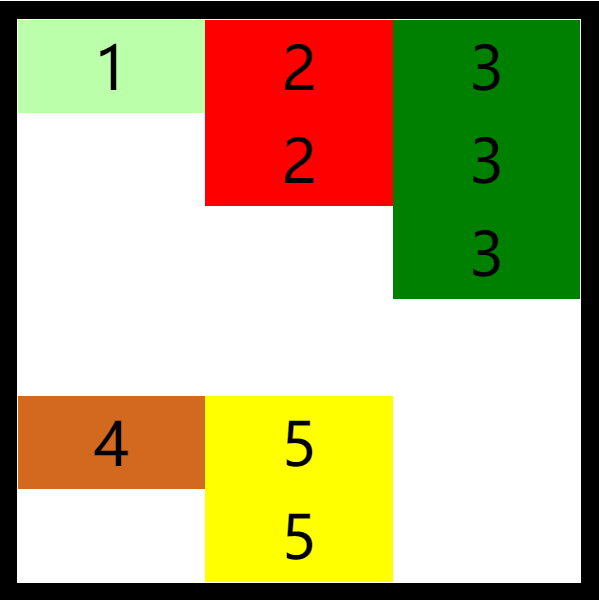
space-evenly 空白分布到元素的单侧
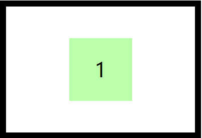
弹性居中
利用弹性盒对元素进行水平垂直双方向居中
1
2
| justify-content: center;
align-items: center;
|
弹性元素的属性
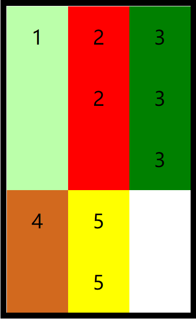
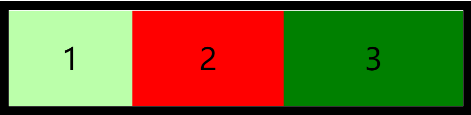
伸展系数
flex-grow 指定弹性元素的伸展系数,默认值为 0
- 当父元素有多余空间的时,子元素如何伸展
- 父元素的剩余空间,会按照比例进行分配
1
2
3
4
5
6
7
8
9
10
11
12
13
14
| li:nth-child(1) {
background-color: #bfa;
flex-grow: 1;
}
li:nth-child(2) {
background-color: red;
flex-grow: 2;
}
li:nth-child(3) {
background-color: green;
flex-grow: 3;
}
|
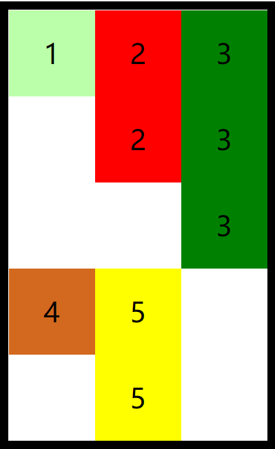
缩减系数
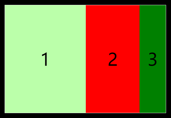
flex-shrink 指定弹性元素的收缩系数,默认值为 1
- 当父元素中的空间不足以容纳所有的子元素时,如何对子元素进行收缩
- 缩减系数的计算方式比较复杂,缩减多少是根据 缩减系数 和 元素大小 来计算
1
2
3
4
5
6
7
8
9
10
11
12
13
14
| li:nth-child(1) {
background-color: #bfa;
flex-shrink: 1;
}
li:nth-child(2) {
background-color: red;
flex-shrink: 2;
}
li:nth-child(3) {
background-color: green;
flex-shrink: 3;
}
|
基础长度
flex-basis 指定的是元素在主轴上的基础长度
- 如果主轴是横向的,则该值指定的就是元素的宽度
- 如果主轴是纵向的,则该值指定的就是元素的高度
- 默认值是
auto,表示参考元素自身的高度或宽度
- 如果传递了一个具体的数值,则以该值为准
1
2
3
4
| li:nth-child(1) {
background-color: #bfa;
flex-basis: 200px;
}
|

简写属性
1
| flex`可以设置弹性元素所有的三个样式 `flex: 增长 缩减 基础
|
initial:flex: 0 1 autoauto:flex: 1 1 autonone:flex: 0 0 auto 弹性元素没有弹性
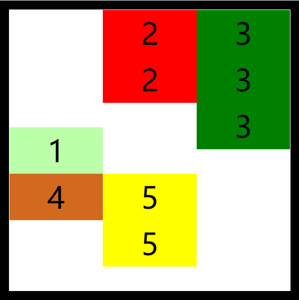
排列顺序
order 决定弹性元素的排列顺序
1
2
3
4
5
6
7
8
9
10
11
12
13
14
| li:nth-child(1) {
background-color: #bfa;
order: 2;
}
li:nth-child(2) {
background-color: red;
order: 3;
}
li:nth-child(3) {
background-color: green;
order: 1;
}
|

覆盖辅轴
1
2
3
4
5
| align-self` 用来覆盖当前弹性元素上的`align-items
li:nth-child(1) {
background-color: #bfa;
align-self: flex-end;
}
|
练习(手机淘宝)
1
2
3
4
5
6
7
8
9
10
11
12
13
14
15
16
17
18
19
20
21
22
23
24
25
26
27
| <style>
.nav{
width: 100%;
}
.nav .nav-inner{
margin-top: 40px;
display: flex;
justify-content: space-around;
}
.nav .item{
width: 19%;
text-align: center;
}
img{
width: 100%;
}
.item a{
text-decoration: none;
color: #333;
font-size: 16px;
}
</style>
|
效果: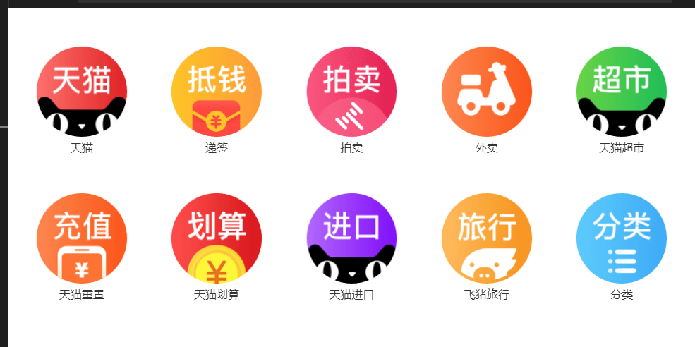
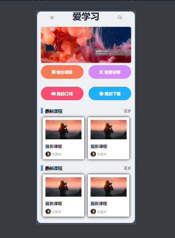
练习(移动端网页)
1
2
3
4
5
6
7
8
9
10
11
12
13
14
15
16
17
18
19
20
21
22
23
24
25
26
27
28
29
30
31
32
33
34
35
36
37
38
39
40
41
42
43
44
45
46
47
48
49
50
51
52
53
54
55
56
57
58
59
60
61
62
63
64
65
66
67
68
69
70
71
72
73
74
75
76
77
78
79
80
81
82
83
84
85
86
87
88
89
90
91
92
93
94
95
96
97
98
99
100
101
102
103
104
105
106
107
108
109
110
111
112
113
114
115
116
117
118
119
120
121
122
123
124
125
126
127
128
129
130
131
132
133
134
135
136
137
138
139
140
141
142
143
144
145
146
147
148
149
150
151
152
153
154
155
156
157
158
159
160
161
162
163
164
165
166
167
168
169
170
171
172
173
174
175
176
177
178
179
180
181
182
183
184
185
186
187
188
189
190
191
192
193
194
195
196
197
198
199
200
201
202
203
204
205
206
207
208
209
210
211
212
213
214
215
216
217
218
219
220
221
222
223
224
225
226
227
228
229
230
231
232
233
234
235
236
237
238
239
240
241
242
243
244
245
246
247
| * {
margin: 0;
padding: 0;
}
.w,
.top-bar,
.banner,
.menu,
.course-list {
width: 17.325rem;
margin: 0 auto;
}
html {
font-size: 5.33333333vw;
background-color: #eff0f4;
}
.top-bar {
display: flex;
height: 4.375rem;
justify-content: space-around;
align-items: center;
}
.top-bar a {
color: #24253d;
}
a {
text-decoration: none;
font-size: 36px;
}
a i {
color: #999;
font-size: 16px;
}
.banner img {
width: 100%;
}
.menu {
height: 8.225rem;
display: flex;
flex-flow: row wrap;
justify-content: space-between;
}
.menu a {
width: 8.175rem;
height: 2.6rem;
border-radius: 2.5em;
text-align: center;
}
.menu a i {
color: white;
line-height: 2.6rem;
vertical-align: top;
}
.menu .course {
background-color: #fe7b52;
}
.menu .star {
background-color: #d589ff;
}
.menu .sub {
background-color: #ff4f71;
}
.menu .download {
background-color: #0baeff;
}
.item-list {
display: flex;
flex-flow: row;
justify-content: space-around;
}
.course-list {
height: 9.85rem;
display: flex;
flex-flow: column;
justify-content: space-between;
margin-bottom: 1.15rem;
}
.course-list .title {
display: flex;
justify-content: space-between;
align-items: center;
}
.course-list h2 {
font-size: 0.825rem;
color: #242538;
border-left: 8px solid #3a84ff;
padding-left: 8px;
}
.course-list a {
font-size: 0.7rem;
color: #656565;
}
.item {
box-sizing: border-box;
width: 8rem;
height: 8.1rem;
padding: 0 0.55rem;
background-color: #fff;
box-shadow: 0 0 10px #000000;
border-radius: 5px;
display: flex;
flex-flow: column;
justify-content: space-evenly;
}
.item img {
width: 100%;
}
.item .course-title {
font-size: 0.8rem;
color: #24253d;
}
.item .user-info {
display: flex;
align-items: center;
}
.item .avatar {
width: 1.05rem;
height: 1.05rem;
}
.item .nickname {
font-size: 0.6rem;
color: #aba59f;
margin-left: 4px;
}
<body>
<header class="top-bar">
<div class="menu-btn">
<a href="#">
<i class="fas fa-stream"></i>
</a>
</div>
<h1 class="logo">
<a href="#">
爱学习
</a>
</h1>
<div class="search-btn">
<a href="#">
<i class="fas fa-search"></i>
</a>
</div>
</header>
<div class="banner">
<a href="#">
<img src="./img/17/banner.png" alt="">
</a>
</div>
<nav class="menu">
<a class="course" href="#">
<i class="fas fa-book"> 我的课程</i>
</a>
<a class="star" href="#">
<i class="fas fa-cut"> 明星讲师</i>
</a>
<a class="sub" href="#">
<i class="fas fa-envelope"> 我的订阅</i>
</a>
<a class="download" href="#">
<i class="fas fa-globe"> 我的下载</i>
</a>
</nav>
<div class="course-list">
<div class="title">
<h2>最新课程</h2>
<a href="#" class="more">更多</a>
</div>
<div class="item-list">
<div class="item">
<div class="cover">
<img src="./img/17/cover.png" alt="">
</div>
<h3 class="course-title">
摄影课程
</h3>
<div class="user-info">
<div class="avatar">
<img src="./img/17/avatar.png" alt="">
</div>
<div class="nickname">
令狐冲
</div>
</div>
</div>
<div class="item">
<div class="cover">
<img src="./img/17/cover.png" alt="">
</div>
<h3 class="course-title">
摄影课程
</h3>
<div class="user-info">
<div class="avatar">
<img src="./img/17/avatar.png" alt="">
</div>
<div class="nickname">
令狐冲
</div>
</div>
</div>
</div>
</div>
<div class="course-list">
<div class="title">
<h2>最新课程</h2>
<a href="#" class="more">更多</a>
</div>
<div class="item-list">
<div class="item">
<div class="cover">
<img src="./img/17/cover.png" alt="">
</div>
<h3 class="course-title">
摄影课程
</h3>
<div class="user-info">
<div class="avatar">
<img src="./img/17/avatar.png" alt="">
</div>
<div class="nickname">
令狐冲
</div>
</div>
</div>
<div class="item">
<div class="cover">
<img src="./img/17/cover.png" alt="">
</div>
<h3 class="course-title">
摄影课程
</h3>
<div class="user-info">
<div class="avatar">
<img src="./img/17/avatar.png" alt="">
</div>
<div class="nickname">
令狐冲
</div>
</div>
</div>
</div>
</div>
</body>
|